🥂

Drinks&Co Marketplace

🥂

Drinks&Co Marketplace

🥂

Drinks&Co Marketplace

Redesign of the Marketplace Purchase Process

client

Drinks&Co Marketplace

role

Product Designer (UX/UI)

Product Designer (UX/UI)

Product Designer (UX/UI)

team

1 PO, 1 Product Designer, 5 Devs

1 PO, 1 Product Designer, 5 Devs

1 PO, 1 Product Designer, 5 Devs

Years

2021 - 2022

2021 - 2022

2021 - 2022

overview

Drinks&Co was an innovative online marketplace specializing in wines and spirits, representing a prominent digital business unit of the multinational Pernod Ricard.

Tasks

🔍

User Research

🔍

User Research

📊

Data-Driven Design

🔀

User Flows

📐

Wireframing

🎨

UI Design

Prototyping

🧩

Design System

The problem

The cart abandonment rate was 88%, and 75% of users dropped off during checkout. This trend was consistent across all domains and devices, with higher abandonment on mobile.

Also, many customers did not realize it was a marketplace, leading to frequent calls asking about high shipping costs.

The goal

Reduce drop-offs by 5% in the cart and checkout by improving the Shopping Funnel UX and decrease by 15% Customer Service calls by visually clarifying that each store has separate shipping costs.

The design process

The design process followed the Double Diamond framework, even unknowingly. It began with understanding user needs, exploring insights, and defining key challenges. Then, potential solutions were developed, refined, and transformed into business opportunities, ensuring both user value and strategic impact.

The old shopping funnel

The old shopping funnel had a more SEO-driven approach, featuring repetitive texts and elements that failed to provide real value to the user.

Beginning UX Research Exploration

I began my research with benchmarking and data analysis, gathering insights to drive well-informed and effective design decisions.

Beginning UX Research Exploration

I began my research with benchmarking and data analysis, gathering insights to drive well-informed and effective design decisions.

Beginning UX Research Exploration

I began my research with benchmarking and data analysis, gathering insights to drive well-informed and effective design decisions.

Beginning UX Research Exploration

I began my research with benchmarking and data analysis, gathering insights to drive well-informed and effective design decisions.

Competitor analysis

I studied shopping funnels from our main competitors to identify and compare best practices and key features, gaining a clearer understanding of the current market landscape.

Review of metrics

Together with the Product Owner, we analyzed abandonment rates at each step of the shopping funnel across different domains, devices, and traffic types throughout the current year.

Internal workshops

During the initial phase of the shopping funnel redesign, we conducted internal workshops—such as Value Proposition Mapping and Empathy Mapping—to gain deeper insights into our users' needs. These workshops involved several departments, including Marketing, Affiliation and Customer Service, to ensure diverse perspectives.

UX Research insights

Through initial UX research insights, we identified the following key areas for improvement:

The cart is overloaded with too many messages, making it confusing to navigate.

The design feels outdated and the recommendation block is the first thing we see, which only adds to the clutter.

On the shopping pages, there is no clear distinction between multi-order items, which contributes to customer confusion.

The mobile experience is lacking—navigation is awkward, and the responsiveness needs serious improvement.

Challenges

During the research phase, we identified a significant gap in the documentation.

🧗

Missing guidelines and countless edge cases

There were no precise guidelines outlining all possible corner cases. Given the complexity of operating as a marketplace, analyzing all the scenarios across different domains posed a considerable challenge for my team.

🏆

Technical challenge

Another significant challenges was addressing the legacy code. Updating the underlying technology required months of dedicated work by the development team, which delayed the launch of the new interface until following year.

Wireframing & Prototyping

Here a sample of the first versions of wireframes made after we analysed all of the data that we were able to recollect.

Prioritize Key Points

We decided to prioritize the functionalities of the new Shopping Funnel using the Eisenhower Matrix. This tool helped us create a structured backlog in Jira, enabling us to implement incremental changes across different sections of the Shopping Funnel.

Some of these changes were critical for enhancing the user experience and were given high priority—for instance, reducing information overload and improving clarity through a redesigned layout. Others were driven by business needs, such as implementing a mandatory login before reaching the checkout or introducing the "private sales" feature.

Launch on the new Shopping Funnel 🚀

Launch on the new Shopping Funnel 🚀

After extensive QA testing in our beta environment for each domain, we were finally ready to launch the new Shopping Funnel in production. Throughout 2021, we implemented the rollout incrementally, starting with the less critical domains and culminating with the launch in Spain, our top-performing market.

Clear indication of the seller

For a marketplace, specifying the store shipping the order is essential.

Clear indication of the seller

For a marketplace, specifying the store shipping the order is essential.

Improved unit selector

Improved the clickable area of units for mobile devices.

Improved unit selector

Improved the clickable area of units for mobile devices.

Messages simplification

To reduce information overload, we focused only on essential messages.

Messages simplification

To reduce information overload, we focused only on essential messages.

Unified size of images

Unifying image sizes in the cart ensured a cleaner layout.

Unified size of images

Unifying image sizes in the cart ensured a cleaner layout.

Clear shipping information

Shipping costs and delivery times presented more clearly for each seller.

Clear shipping information

Shipping costs and delivery times presented more clearly for each seller.

A tidy Order Summary

Enhanced clarity and maked the information easier to read.

A tidy Order Summary

Enhanced clarity and maked the information easier to read.

Cross-sells block below

The cross-sells block was moved below to ensure the cart is the first thing users see.

Cross-sells block below

The cross-sells block was moved below to ensure the cart is the first thing users see.

Crafting high-fidelity designs

Crafting high-fidelity designs

Every interface was crafted as high-fidelity designs using the Atomic Design methodology, breaking down components into their simplest forms.


These modular building blocks came to life in Storybook, ensuring a consistent and reusable design system for seamless development.

Streamlined Handoff for Development

Streamlined Handoff for Development

Through meticulous documentation and assets, we bridged the gap between design and development, providing clear guidelines that ensured a seamless implementation.


By addressing interaction details and edge cases upfront, we eliminated potential misunderstandings and crafted solutions for every scenario.

Corner cases sample

Creation of a Design System

One side effect of this project was was the creation of the company’s first Design System, establishing the foundations for a cohesive brand identity and scalable components.

Later, we successfully migrated the system from Sketch to Figma to enhance collaboration and streamline workflows.

Test, monitor, iterate

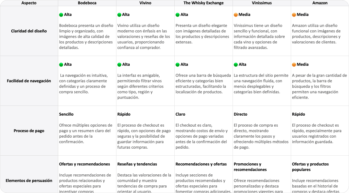
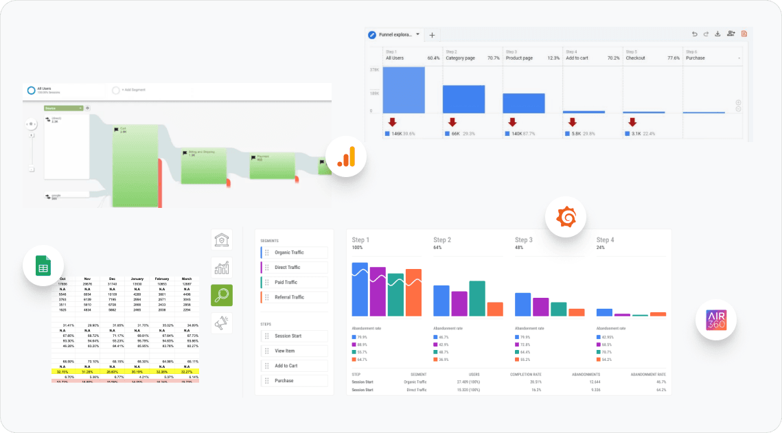
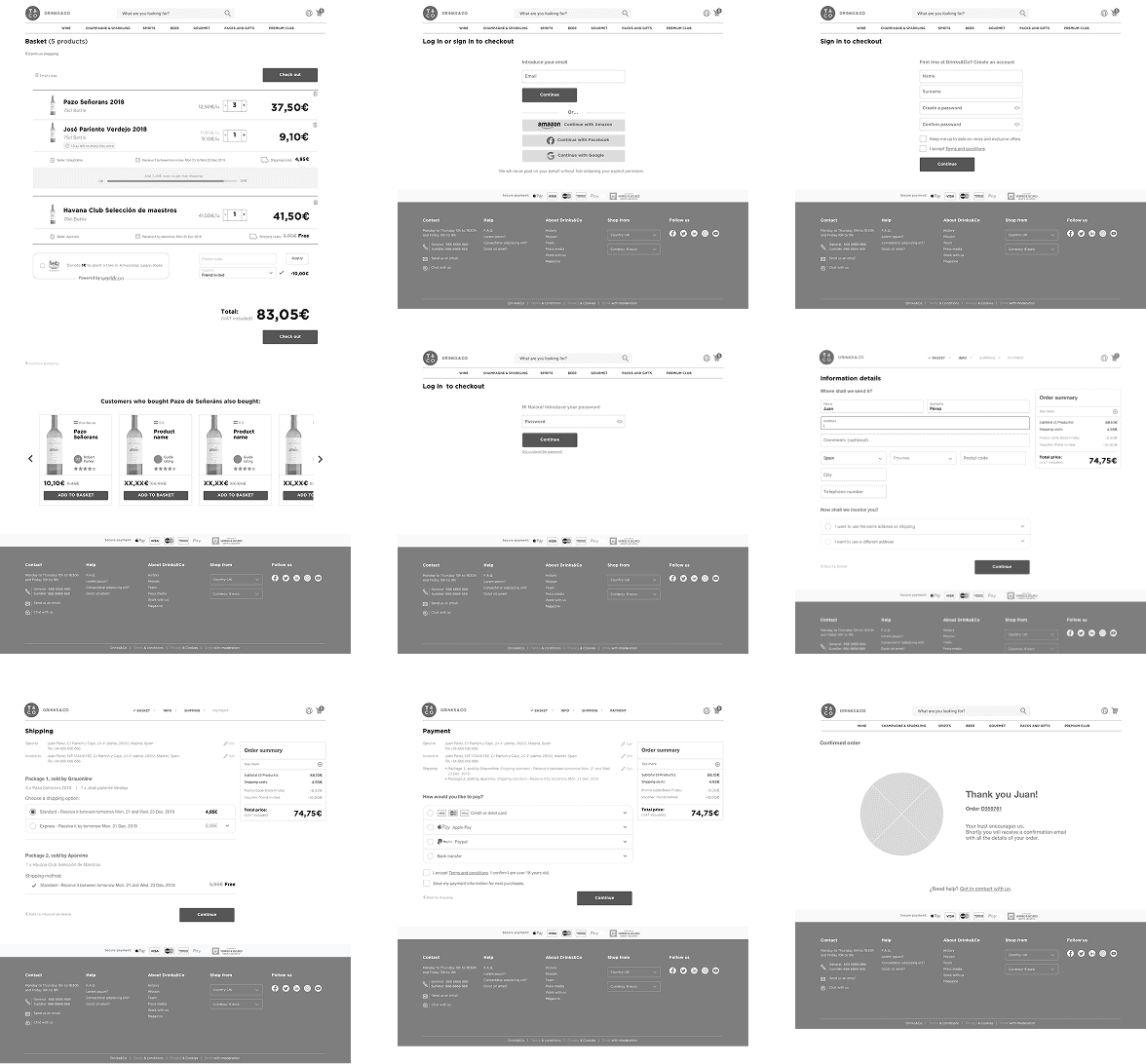
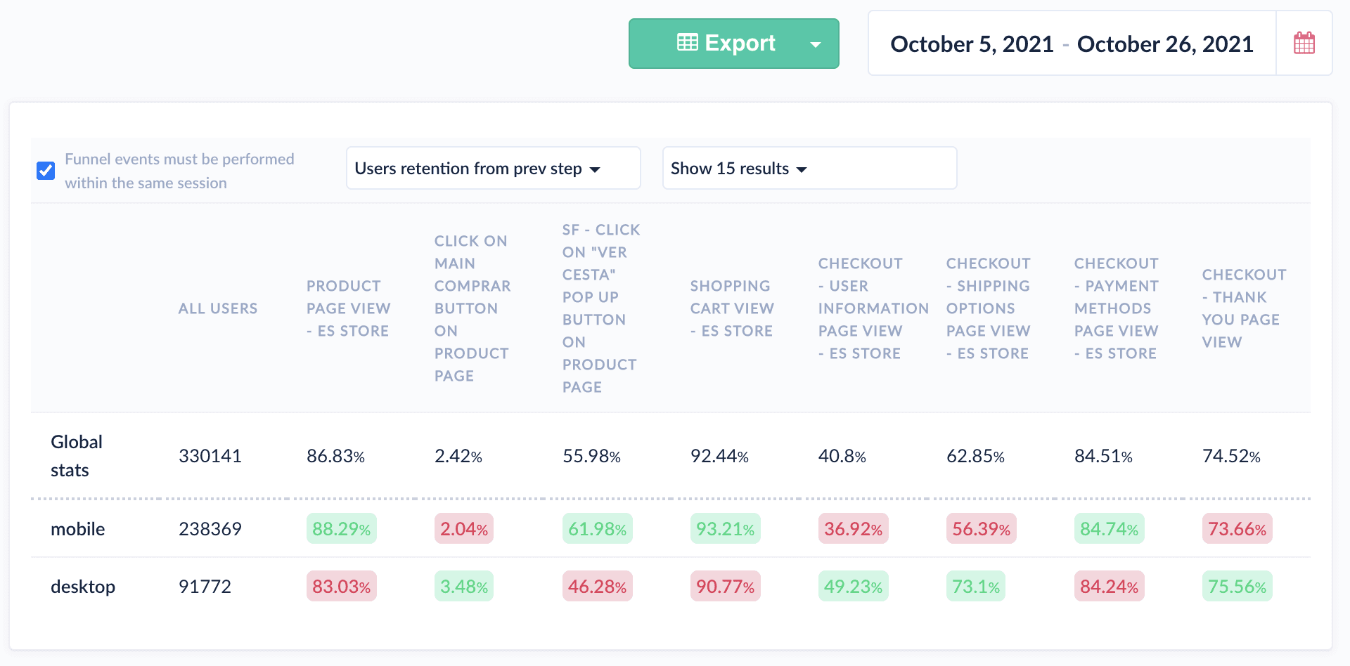
In the months after launch, we gradually introduced new features across various sections of the Shopping Funnel to improve the user experience. We continuously analyzed metrics and conducted surveys using tools like Typeform and Hotjar to identify patterns.

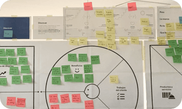
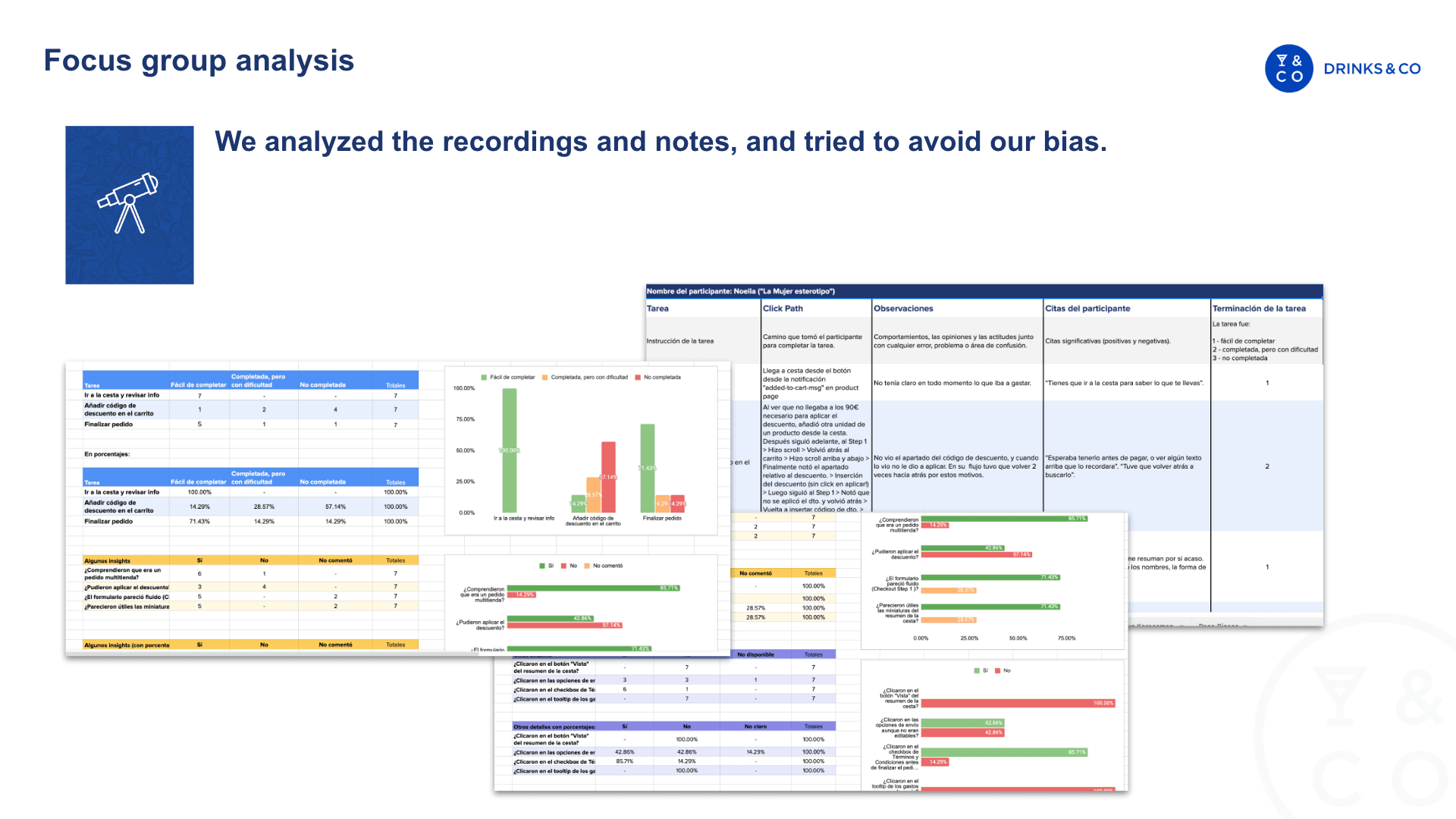
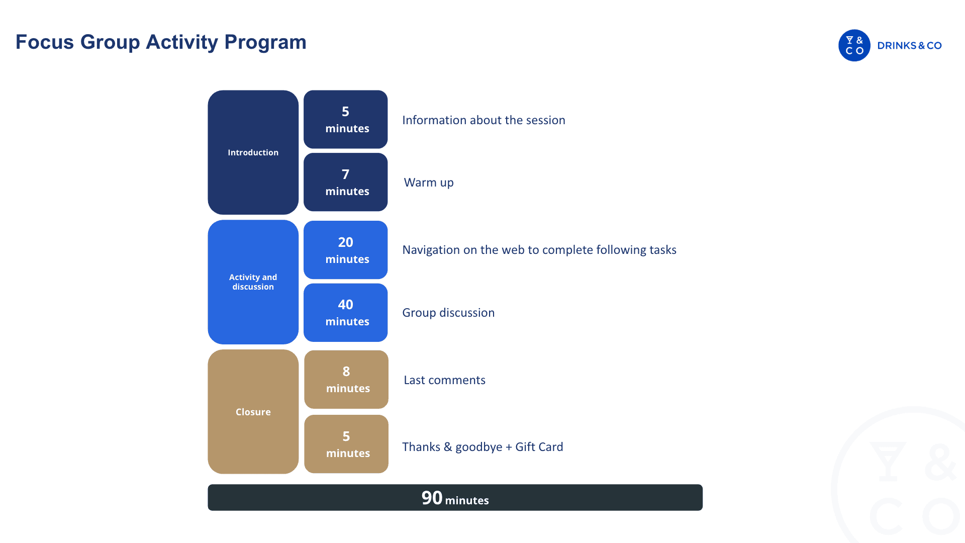
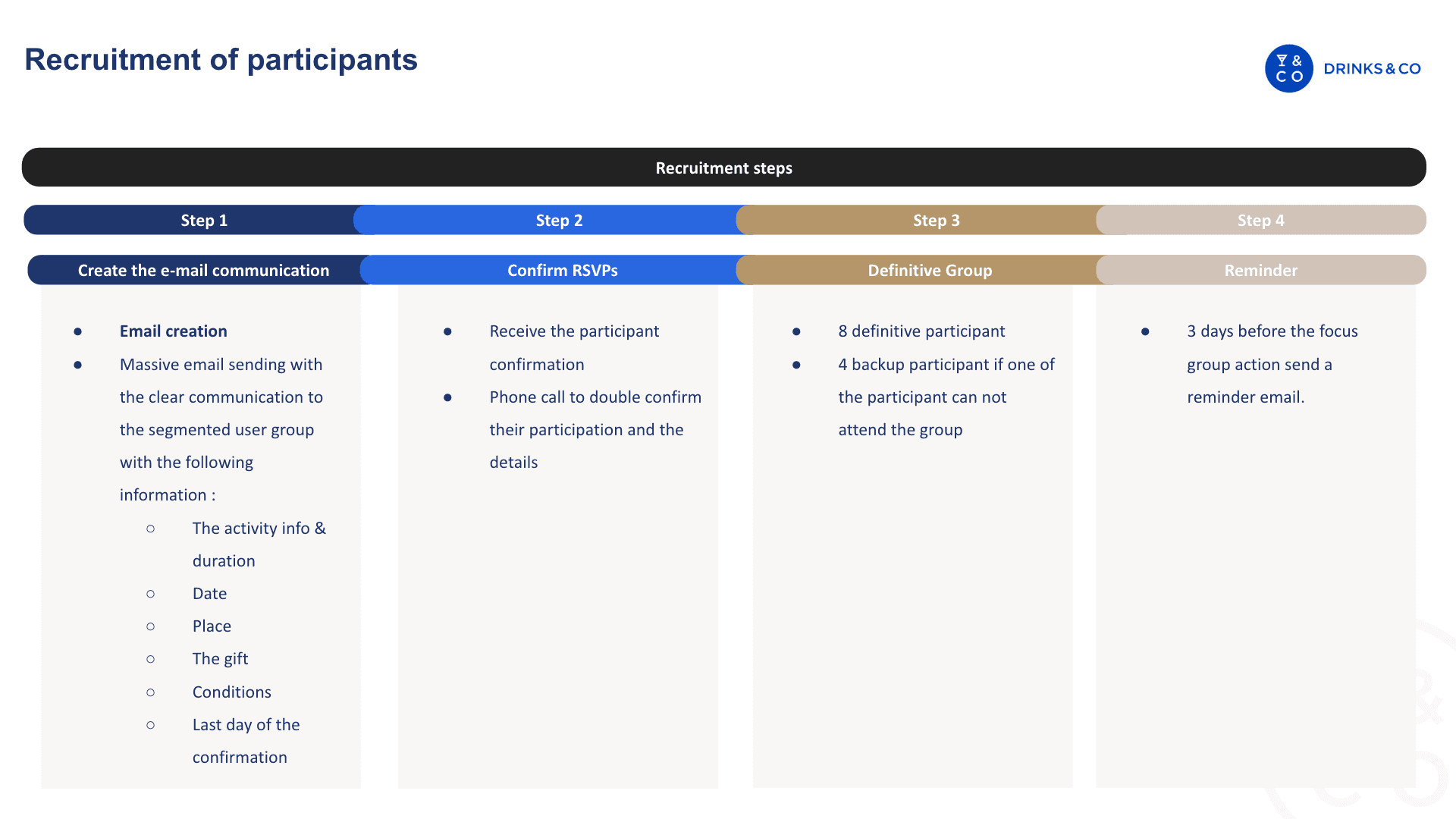
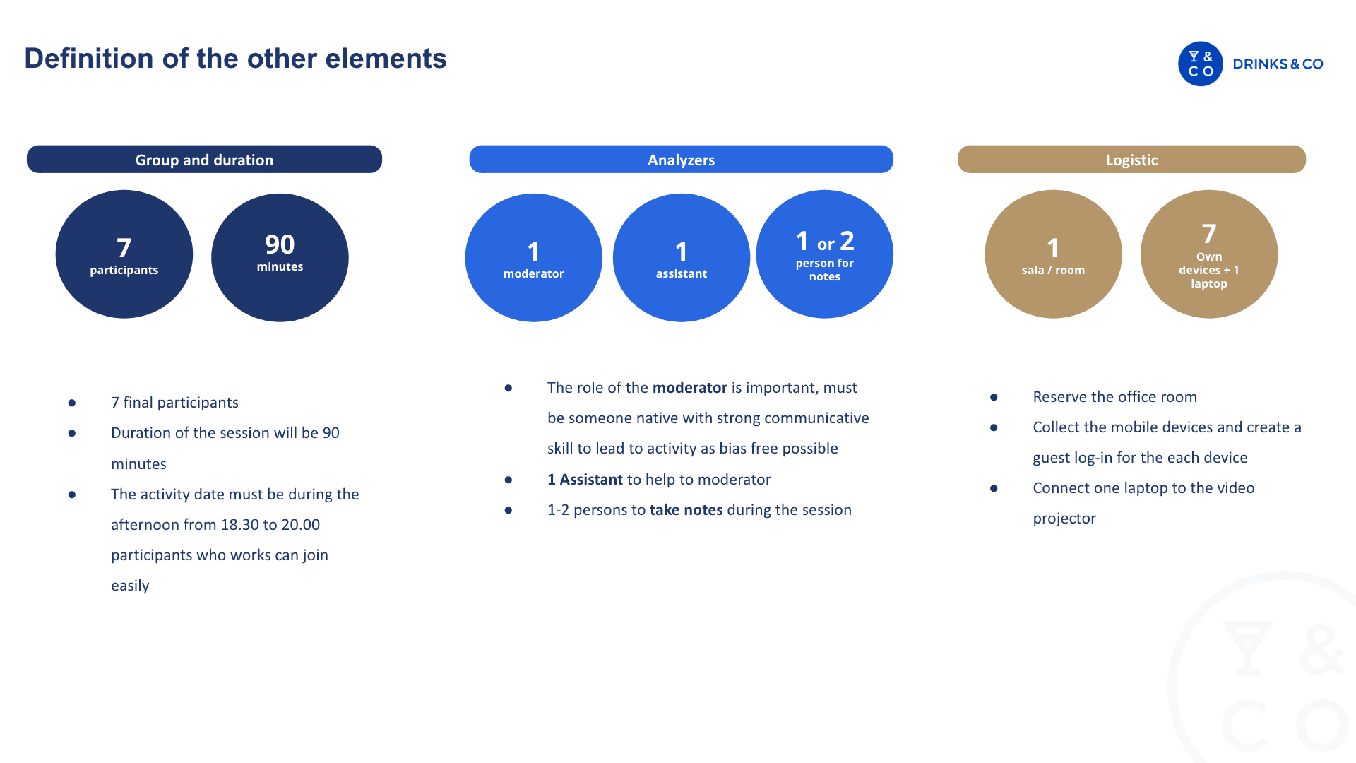
To gain deeper insights into the shopping experience on Drinks&Co, we combined qualitative and quantitative data. Given resource constraints, we organized a Focus Group, which proved highly effective in quickly gathering spontaneous user feedback on the purchasing process of Drinks&Co.


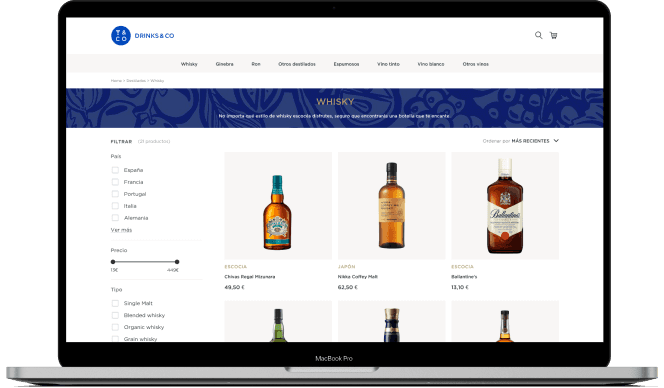
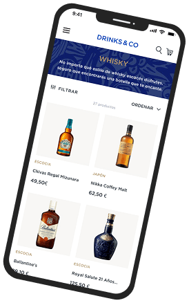
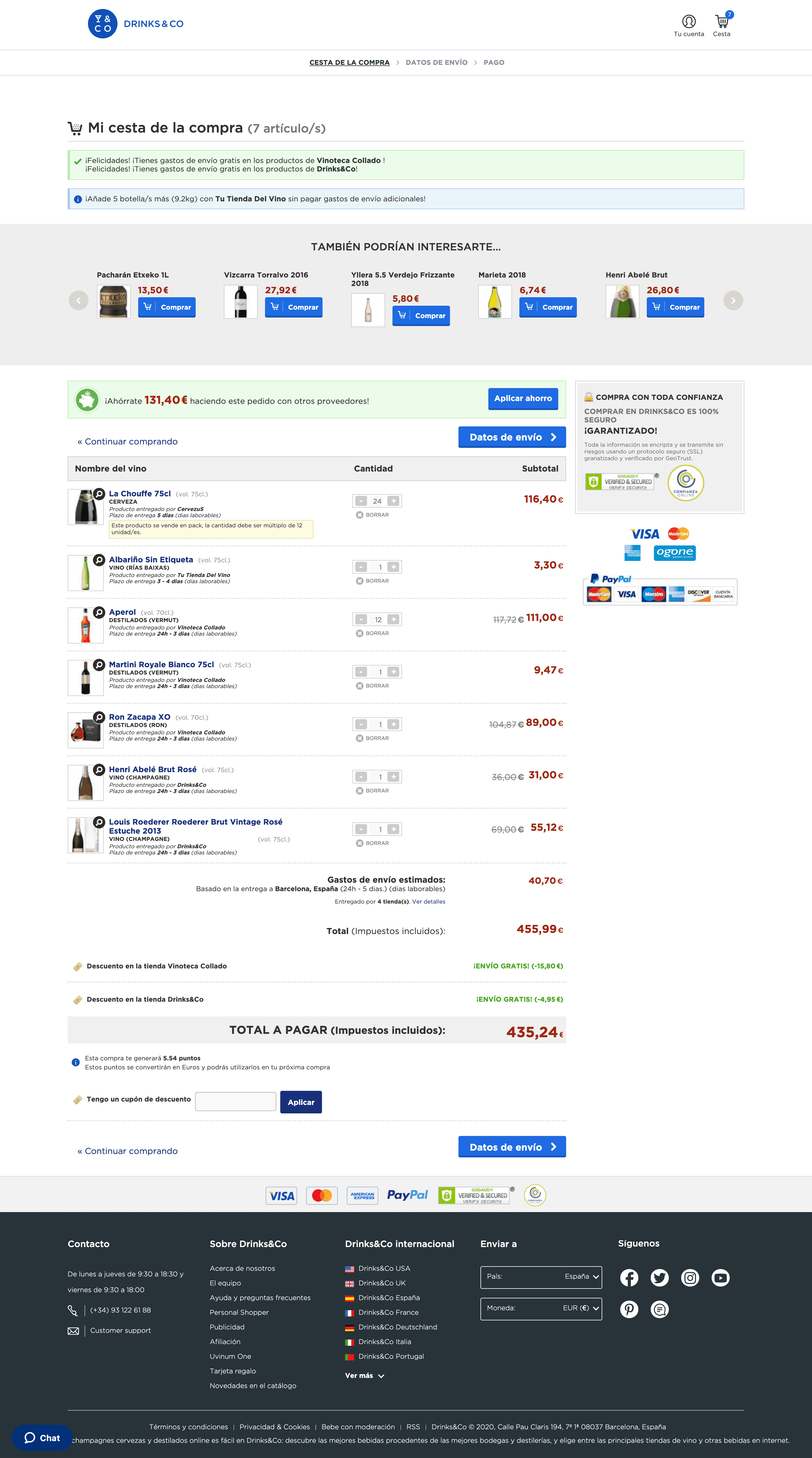
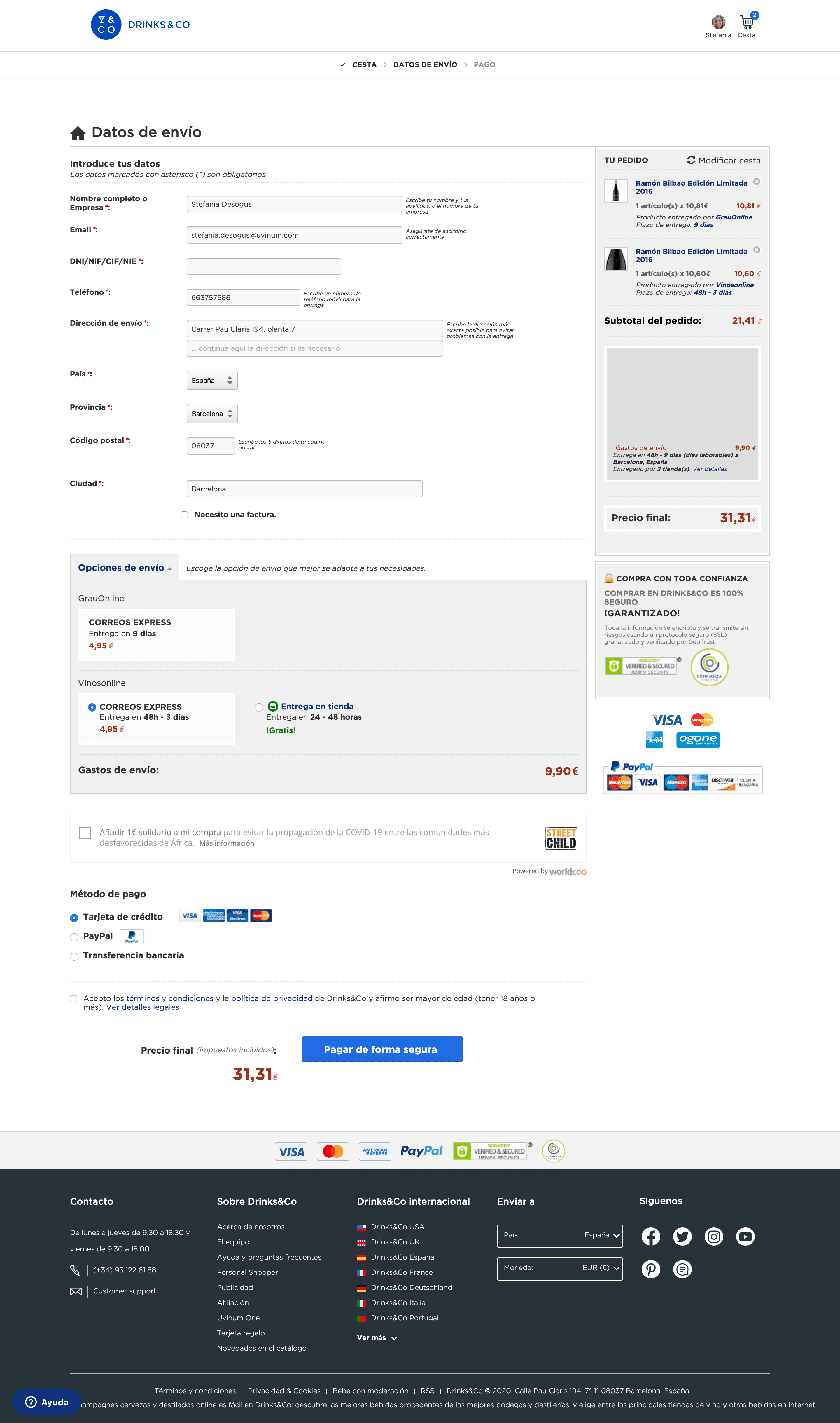
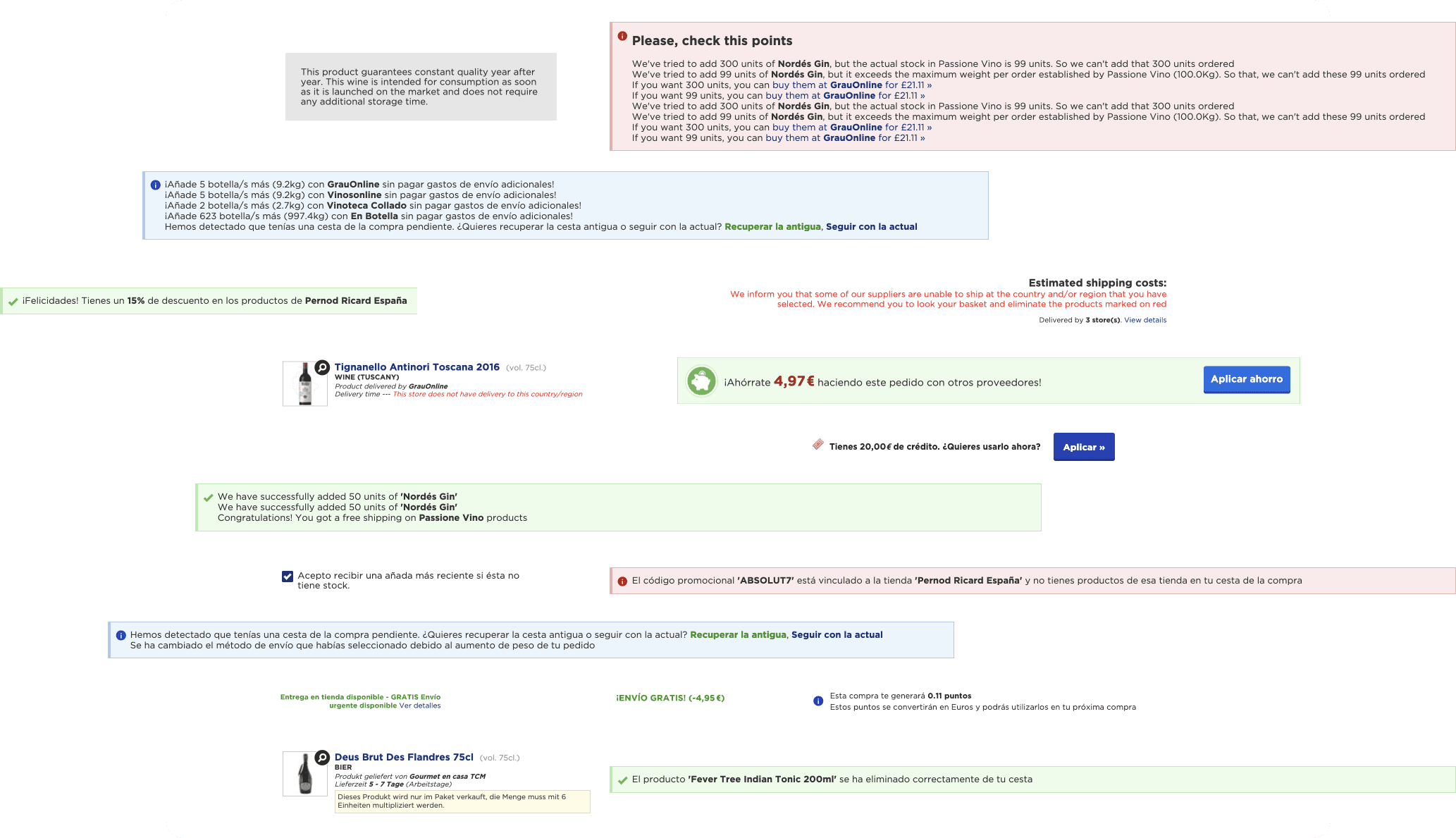
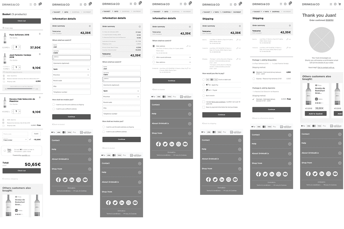
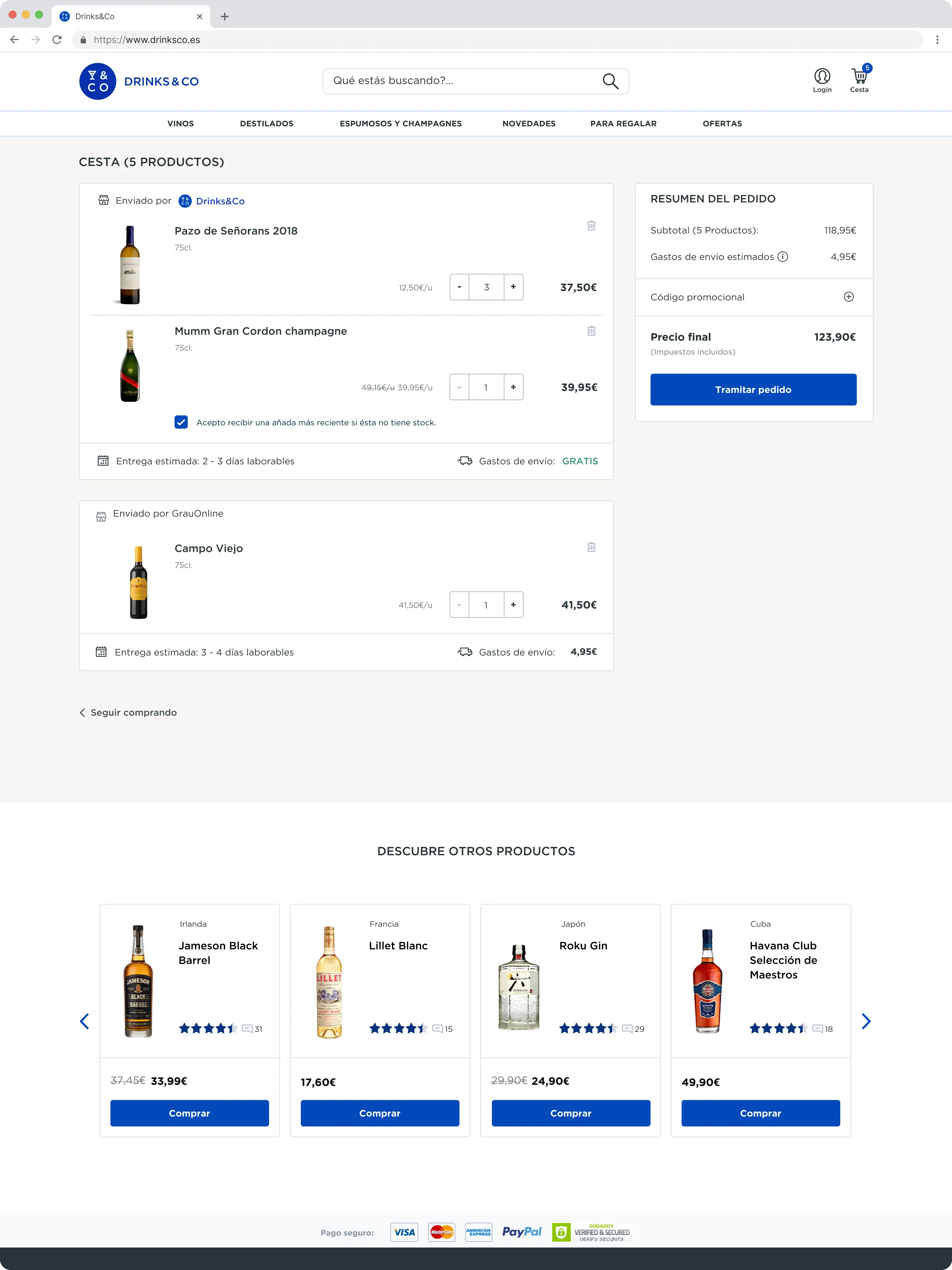
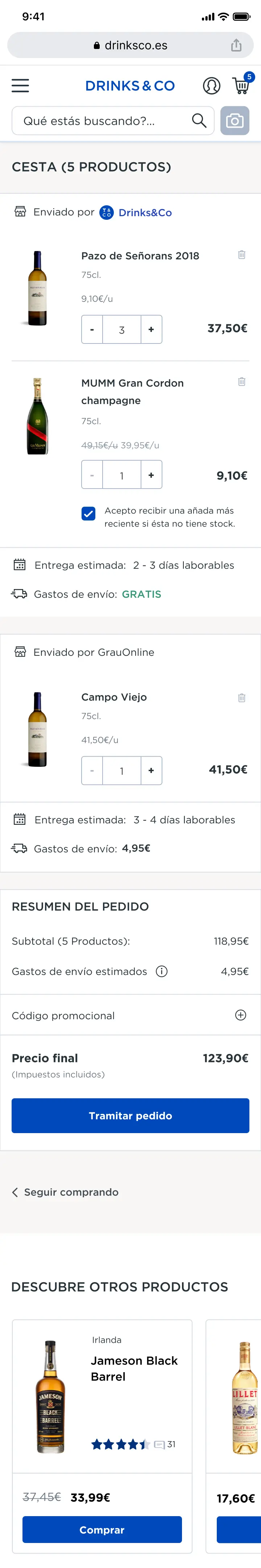
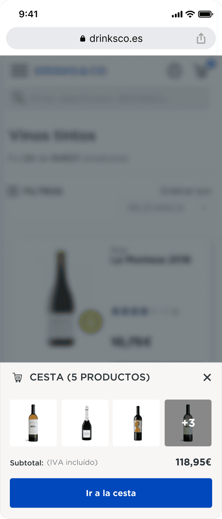
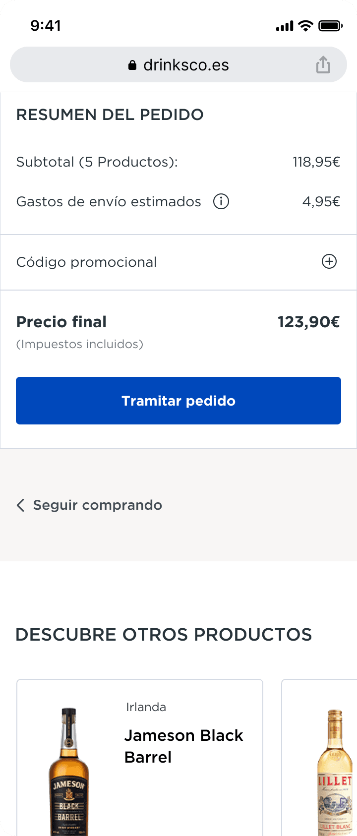
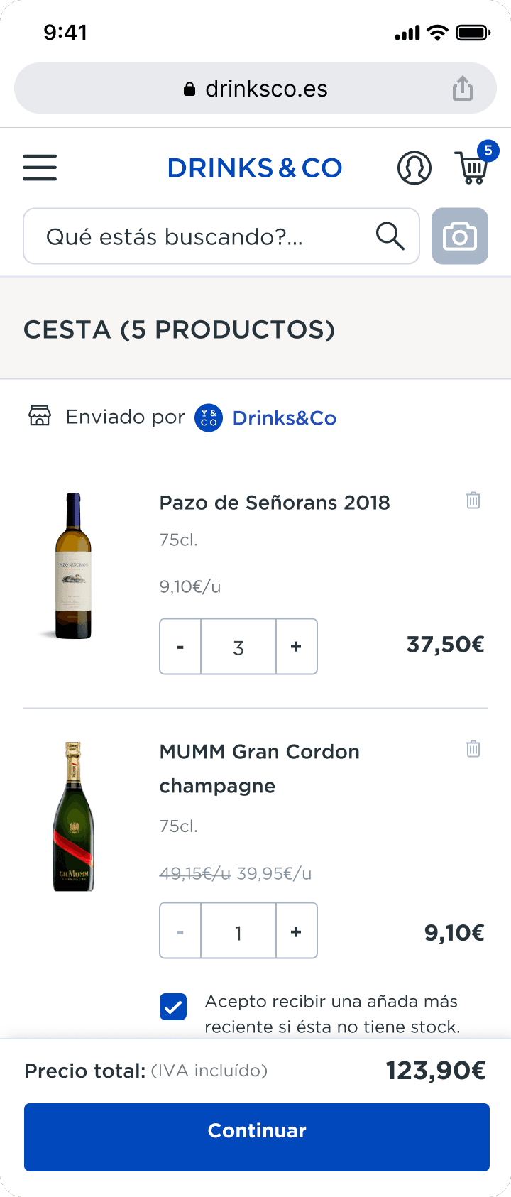
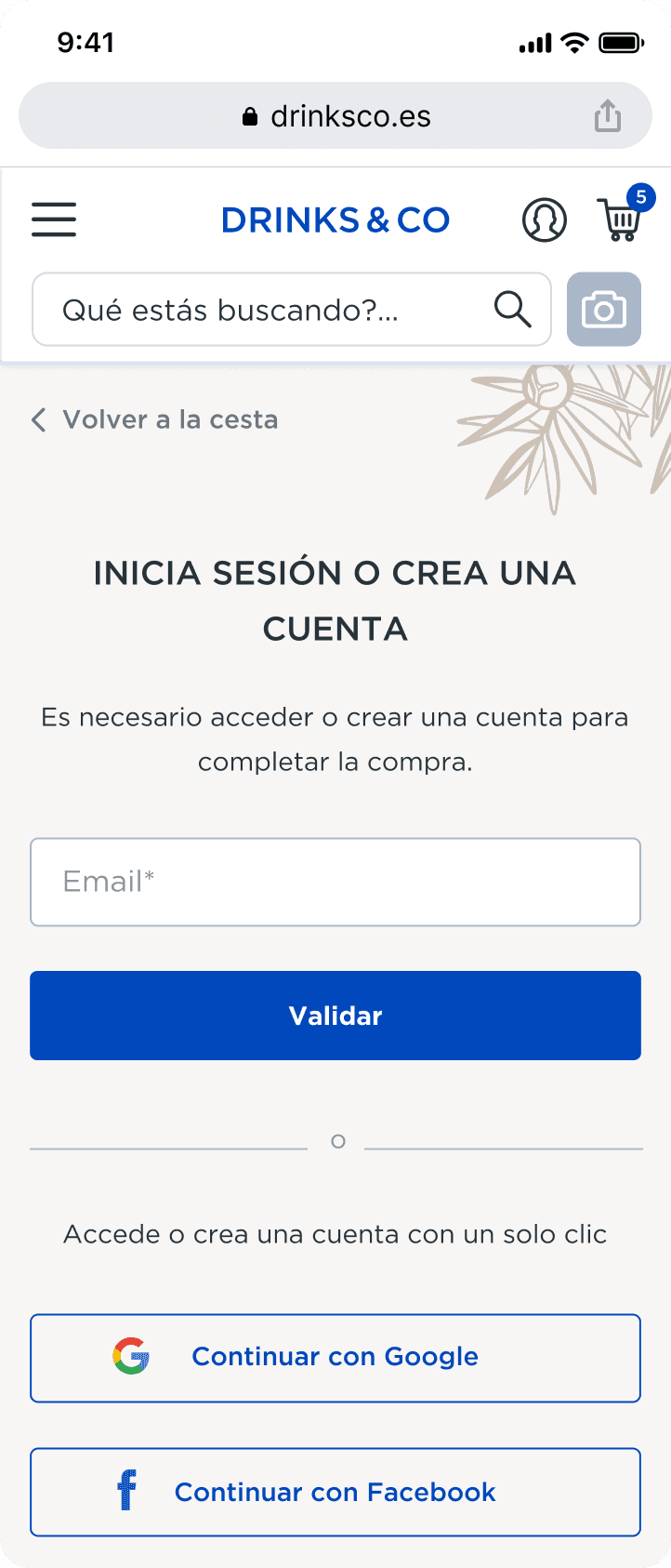
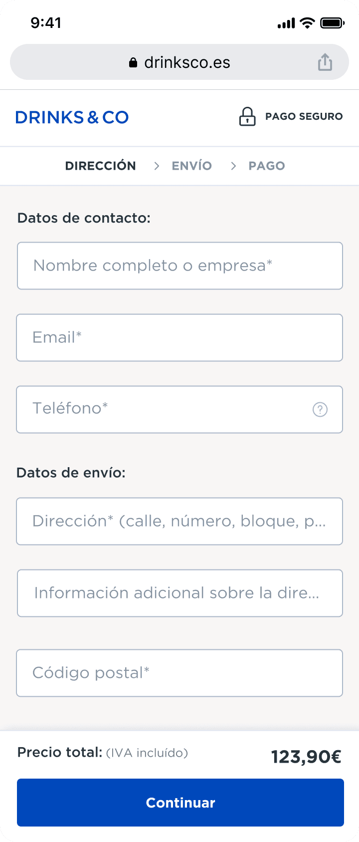
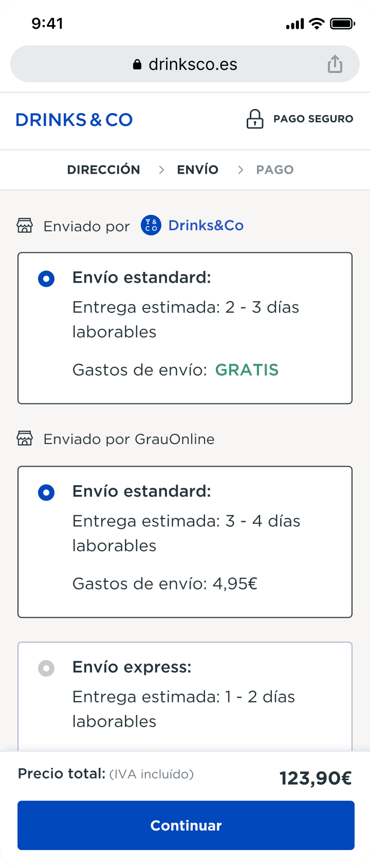
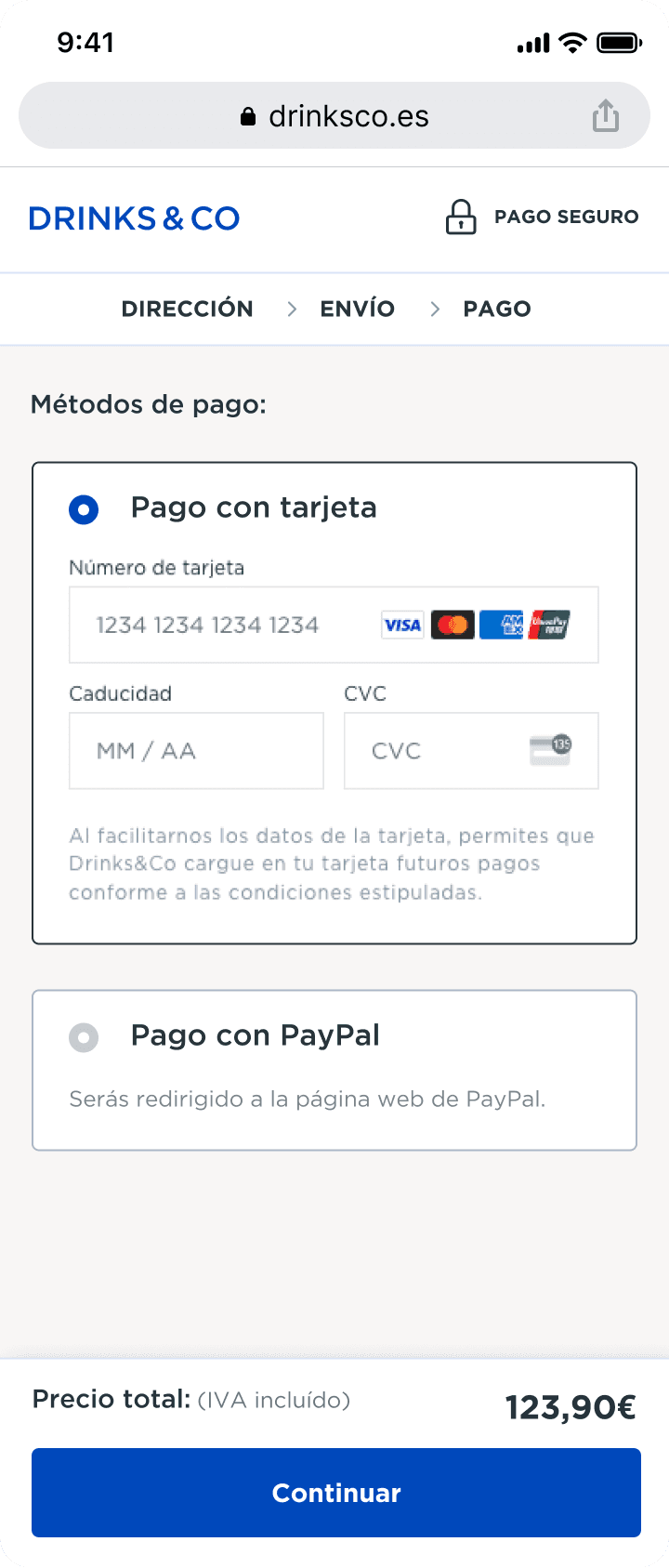
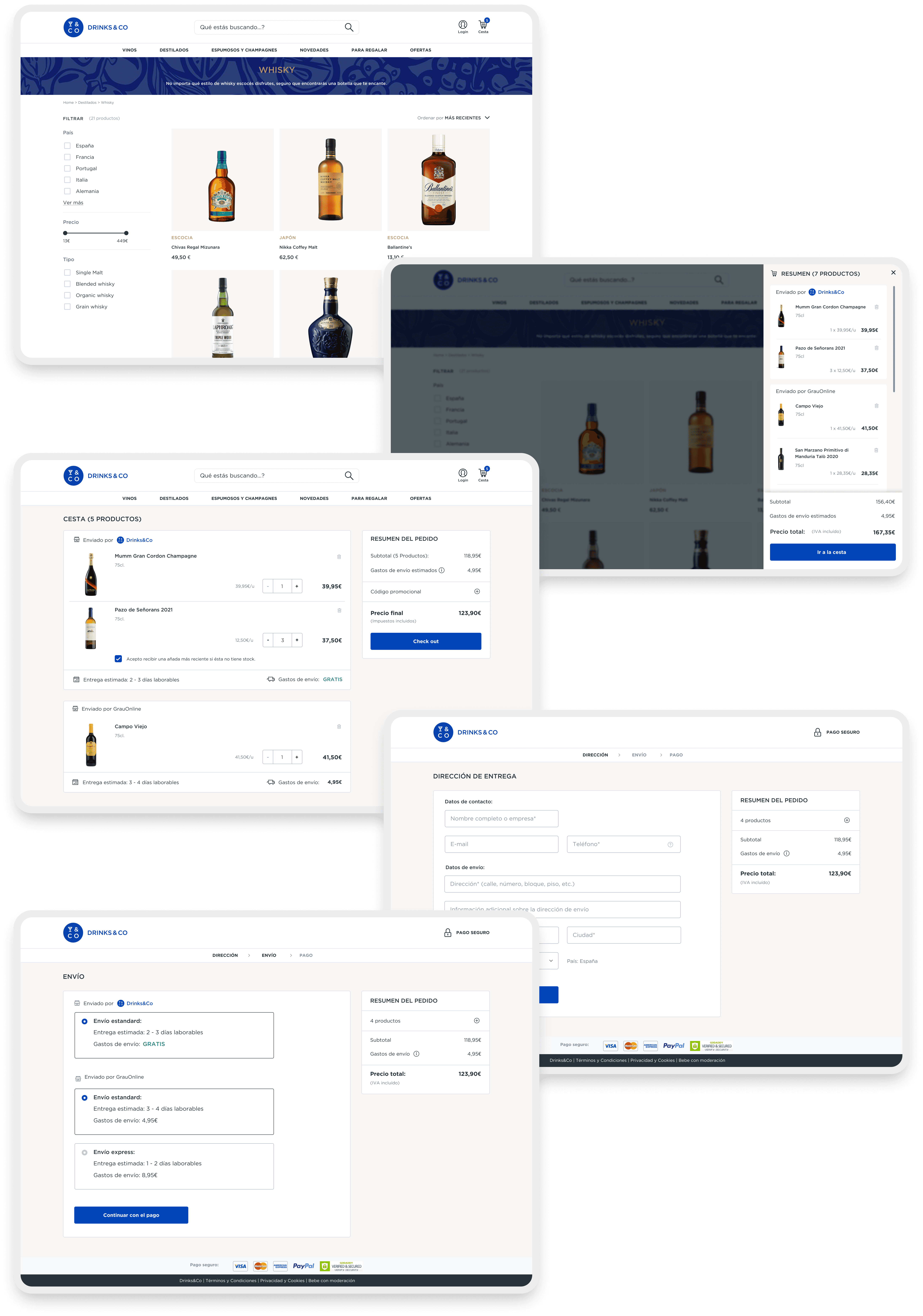
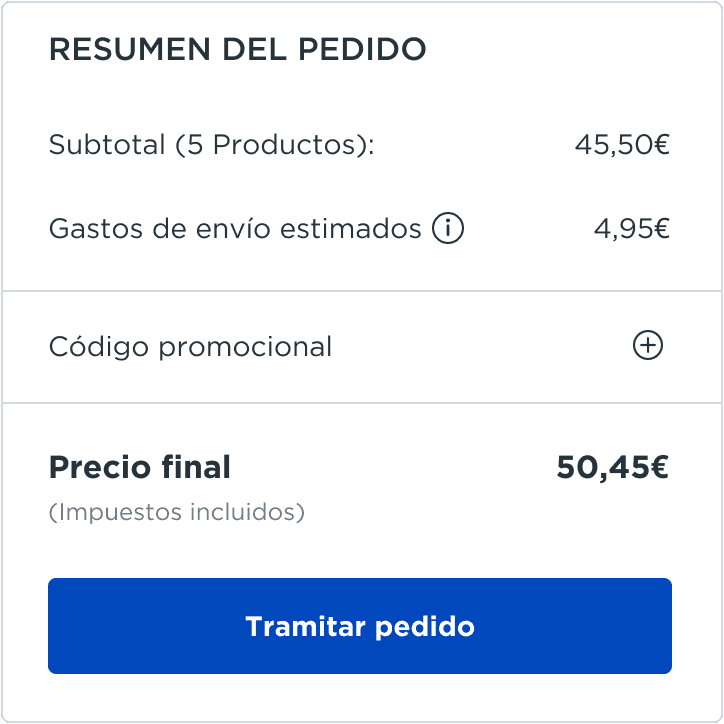
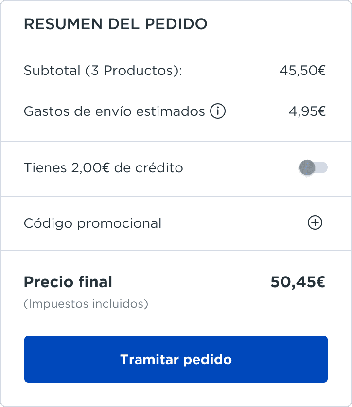
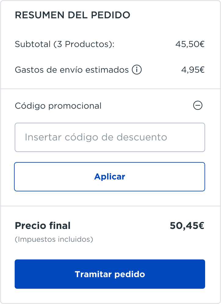
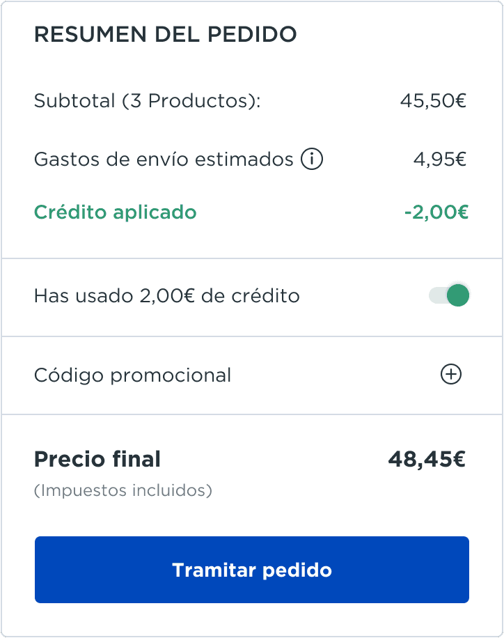
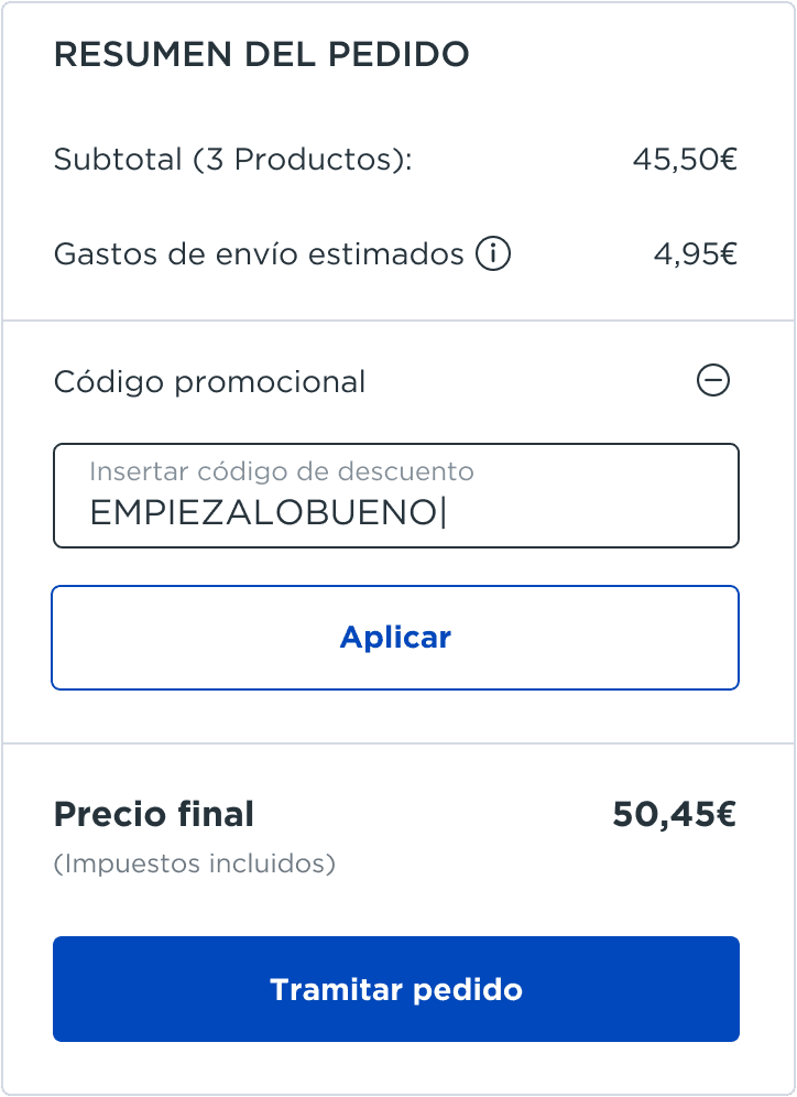
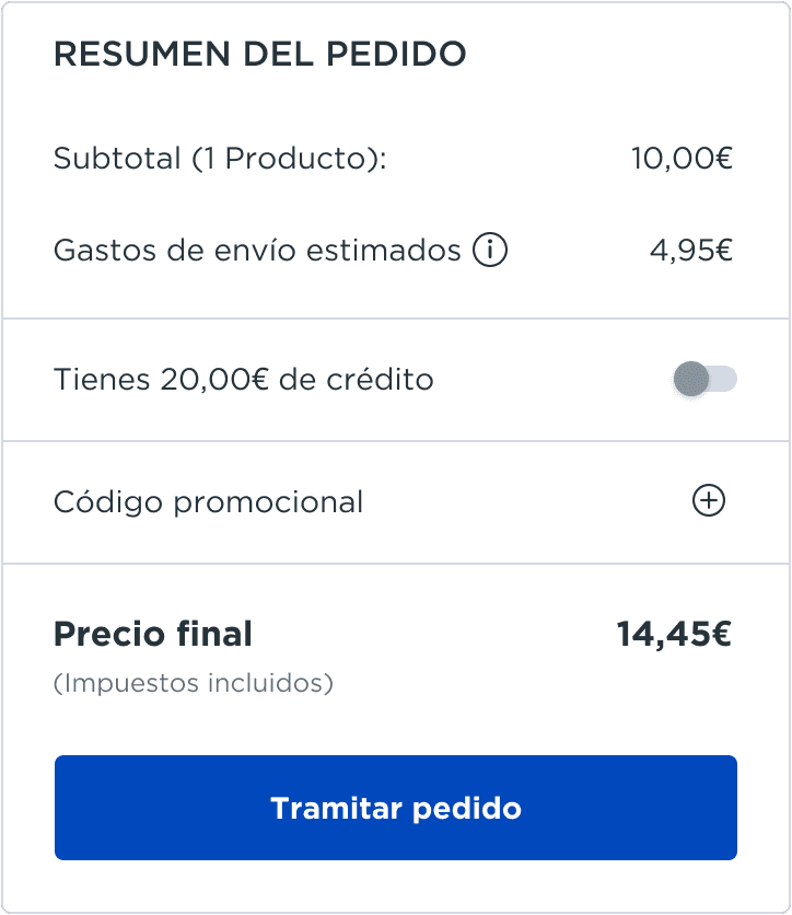
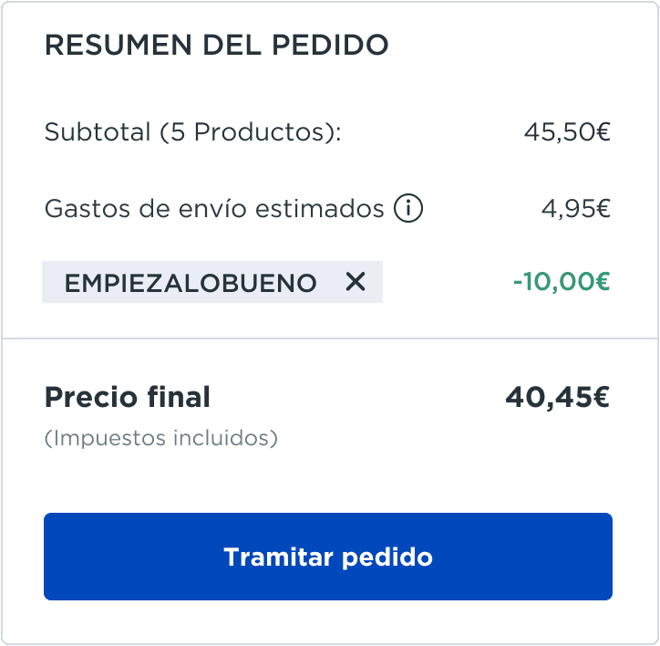
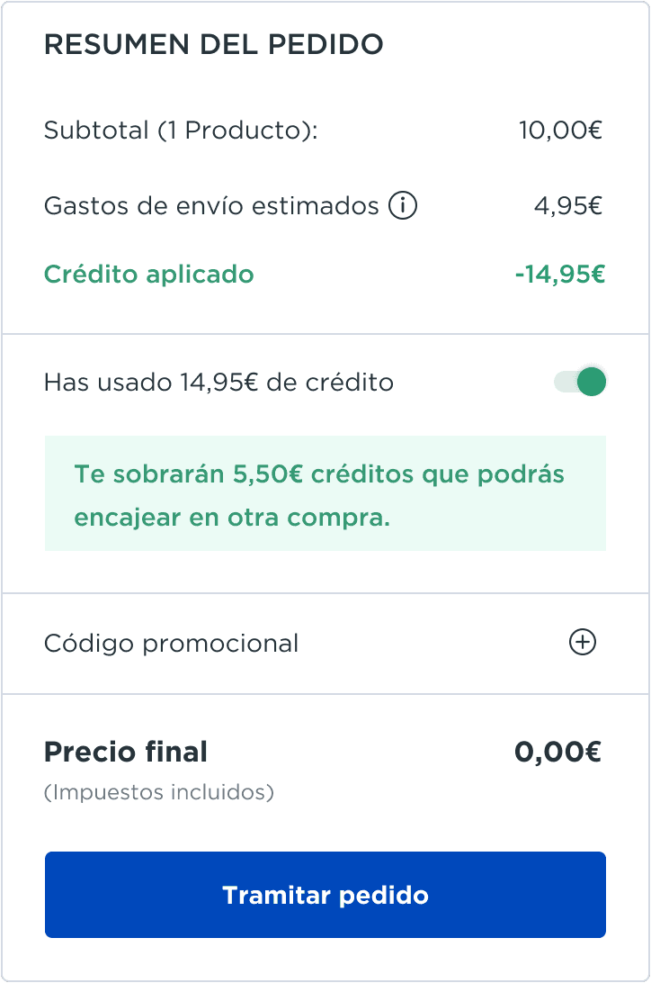
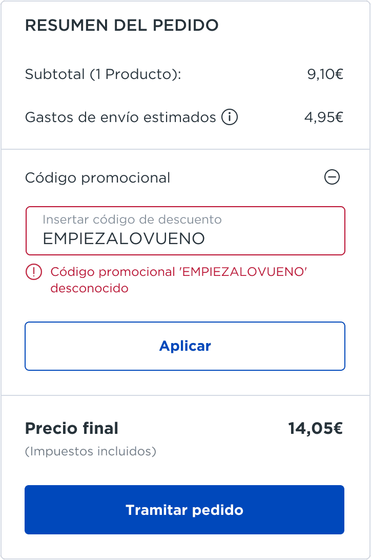
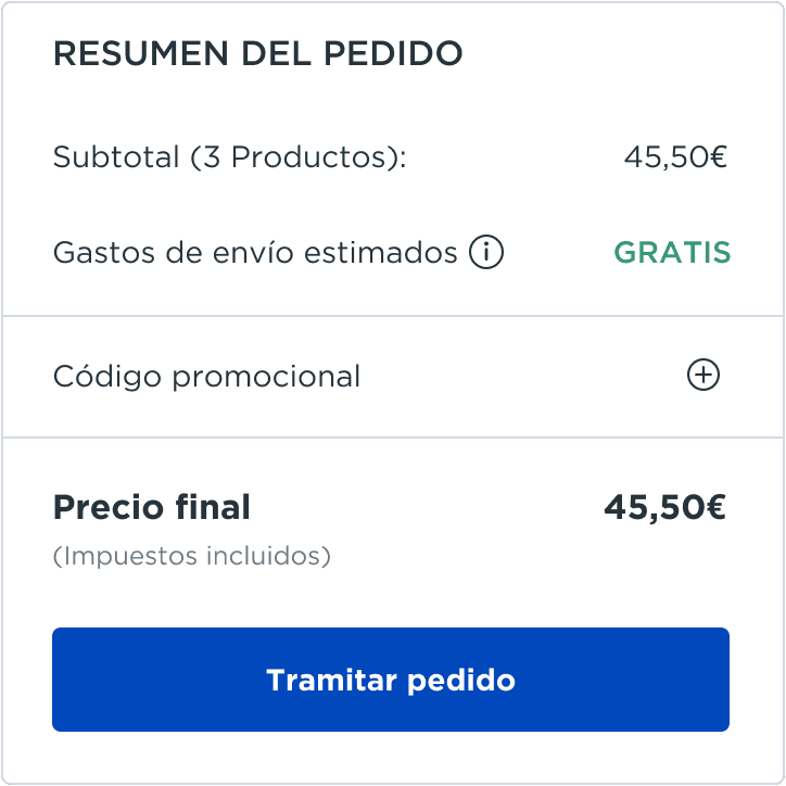
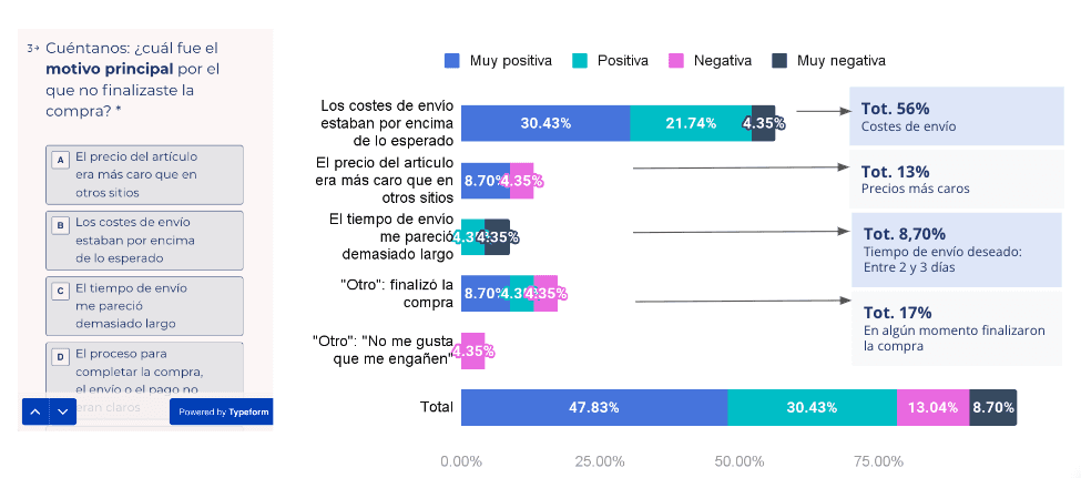
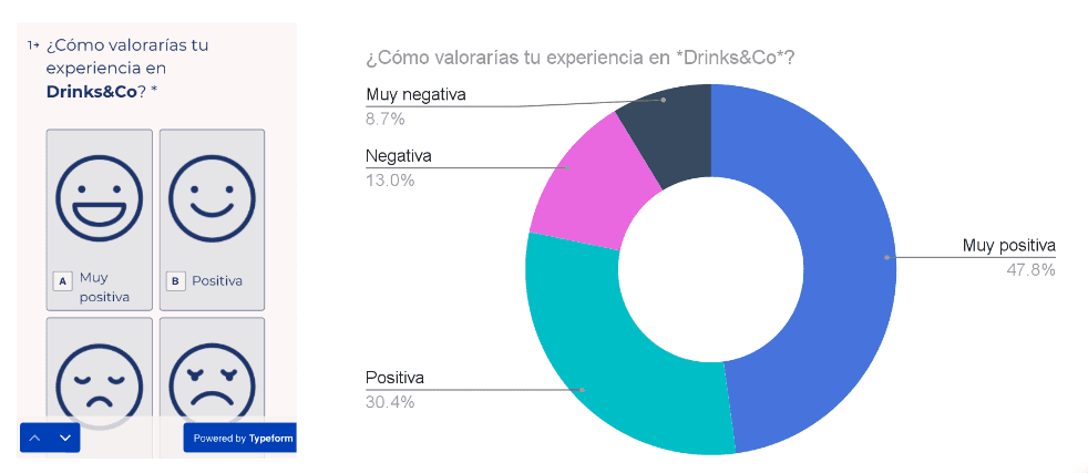
Our users understood that varying shipping costs were a result of purchasing through a marketplace. Overall, they found the new checkout process smooth and intuitive on both mobile and desktop, reaffirming that we were on the right track.

The results

With all the incremental changes in the Shopping Funnel we have achieved a 7% reduction in cart abandonment, surpassing the initial goal of a 5% decrease. Additionally, we reduced drop-off rates significantly throughout the checkout process: 19% from Step 1 to Step 2, 14% from Step 2 to Step 3, and an impressive 24% between Step 3 and the Order Confirmation page.


We also observed a 15% reduction in Customer Service calls related to shipping cost inquiries, further confirming that the new Shopping Funnel was working effectively.

7%

Reduction in cart abandonment

7%

Reduction in cart abandonment

7%

Reduction in cart abandonment

19%

Reduction in drop-offs across the entire Checkout

19%

Reduction in drop-offs across the entire Checkout

19%

Reduction in drop-offs across the entire Checkout

+46%

Improvement in Purchase Completion Rate

+46%

Improvement in Purchase Completion Rate

+46%

Improvement in Purchase Completion Rate

Project Learnings 💪

Simplicity is strength. One of our primary goals was to simplify the complexities of the marketplace to ensure users weren’t overwhelmed with information at the critical moment of making a purchase. It was essential to clearly communicate that varying shipping costs were tied to different sellers, helping users navigate the experience effortlessly.

Another significant challenge for our product team was fostering a qualitative research mindset within the company. Gaining leadership's buy-in to invest in this type of research was crucial, as it provides invaluable insights into user needs and behaviors, ultimately driving better decision-making and user-centered solutions.

Created with 💜 by Stefania

Designed and developed using Framer

© 2025 · Stefania Desogus

All Rights Reserved

Created with 💜 by Stefania

Designed and developed using Framer

© 2025 · Stefania Desogus

All Rights Reserved

Created with 💜 by Stefania

Designed and developed using Framer

© 2025 · Stefania Desogus

All Rights Reserved

Created with 💜 by Stefania

Designed and developed using Framer

© 2025 · Stefania Desogus

All Rights Reserved