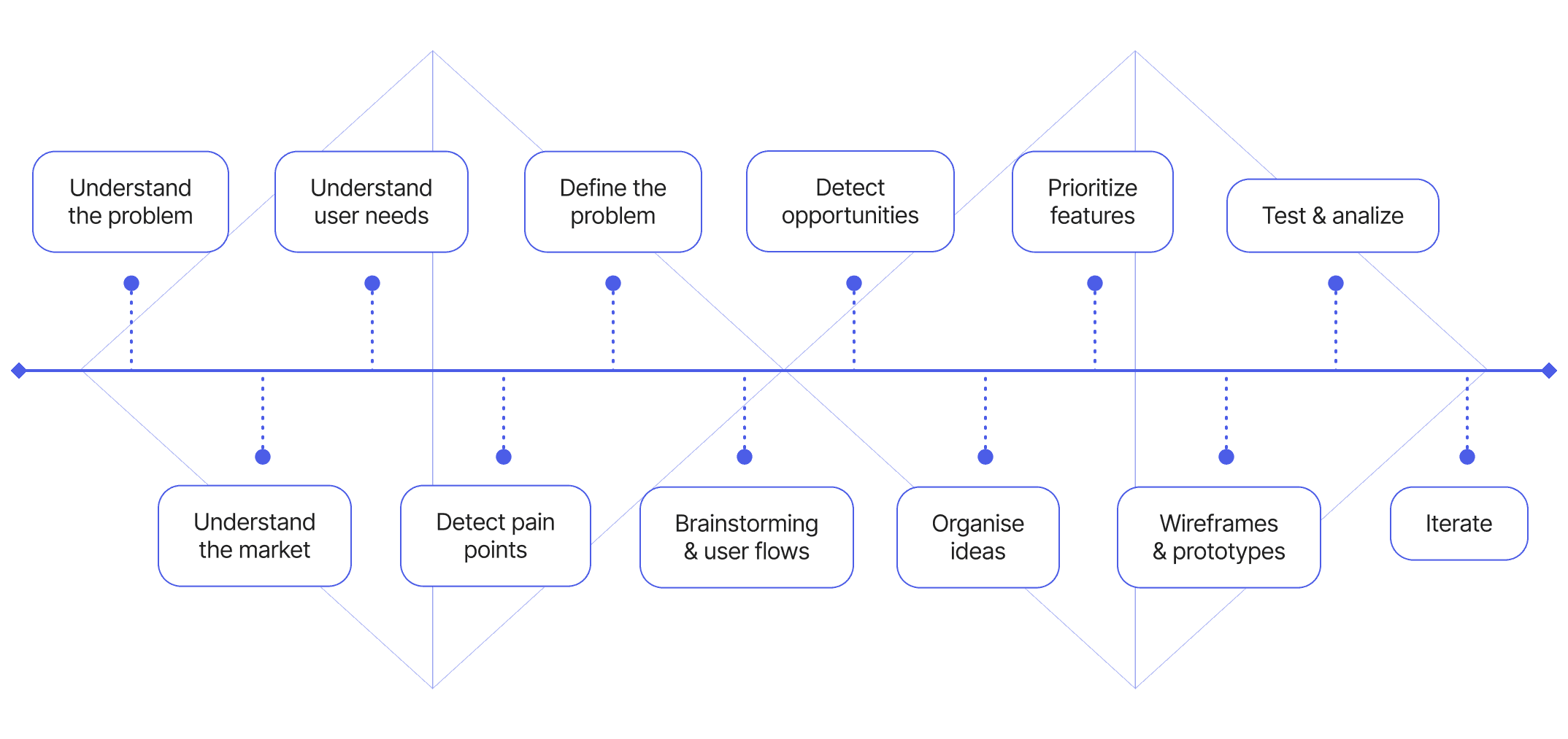
🌸

FloraQueen e-commerce

Revamping Loyalty: A User-Centered Approach to Satisfaction

Overview

FloraQueen is an e-commerce platform specializing in flower sales, delivering premium bouquets to over 90 countries since 2004.

By 2018, the business faced negative customer reviews (averaging 2.2/5 stars on Google), and a growing need to boost repeat purchases. It became clear that a complete overhaul was necessary to simplify the loyalty offering, attract new customers, and rebuild trust in the brand through a more user-focused approach.

My role

UX/UI Designer

timeline

12 weeks

Tasks

🔍

User Research

🔀

User Flows

📐

Wireframing

🎨

UI Design

Prototyping

The problem 🔥

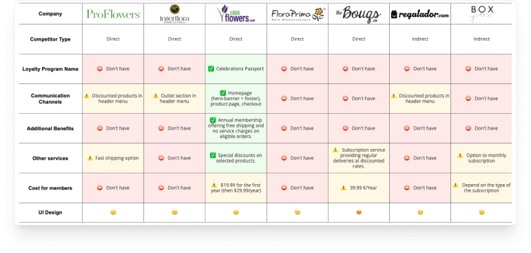
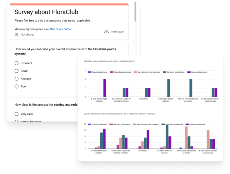
For years, the brand struggled to implement an effective loyalty program. The original “FloraClub” had significant technical and user experience issues. While the idea was to reward customers with points for each purchase, along with event reminders like birthdays, the system often failed to apply points correctly due to technical limitations. Customers rarely benefited from their points as they did not always match their purchases.


As a result, the loyalty program was underused, and the company faced challenges in improving customer retention.

The average cart abandonment rate was 88%, while the drop-off rate during checkout steps reached 75%. This percentage was consistent across all domains (Spain, Germany, France, Italy, Portugal, etc.) and devices. These abandonment rates were even higher on mobile devices, highlighting a clear need for improvement.

Moreover, many customers did not fully understand that it was a marketplace, and there was a high percentage of incidents involving customers calling Customer Service to ask why the shipping costs were so high.

The goal 🎯

The main objective was to encourage users to make additional purchases, improving user experience and increasing customer satisfaction with a new loyalty program.

Design process

Time to investigate 🔦

To gain a deep understanding of user needs, I've employed a mix of qualitative and quantitative research methods.

Competitor analysis

I conducted a benchmark analysis of both direct and indirect competitors to identify relevant patterns for our loyalty program. It became clear that points-based systems were uncommon in the industry. However, we identified other valuable approaches, such as monthly subscriptions, that could inspire new features.

Survey about the current loyalty program

To challenge our assumptions, I conducted an online survey targeting existing customers using Google Forms in the main domains (Spain, France, Germany), gathering 82 responses. 86.7% indicated that the points system was unreliable and the lack of clarity around rewards caused frustration.

First UX insights

Highlighted key quotes from the online survey to guide direction and inspire early design ideas.

"I don’t understand how to redeem points. The information is confusing, and it makes me feel like the program isn’t worth it."

"I tried to use my points, but I couldn’t find any clear explanation of the process. I ended up giving up because it seemed too complicated."

I tried to apply my discount, but it didn't work at checkout. After multiple attempts, I started feeling like this program is more of a scam than a real benefit.

Created with 💜 by Stefania

Designed and developed using Framer

© 2025 · Stefania Desogus

All Rights Reserved

Created with 💜 by Stefania

Designed and developed using Framer

© 2025 · Stefania Desogus

All Rights Reserved

Created with 💜 by Stefania

Designed and developed using Framer

© 2025 · Stefania Desogus

All Rights Reserved